

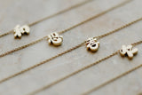

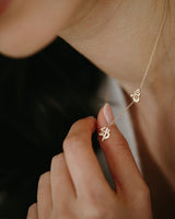




I started Rhapsody in Gold because I wanted to wear my kid's Chinese names in a way that felt modern. I struggled to find something that felt right and this got me thinking WHY I didn't like what I saw on the market already. I definitely didn't like how everything I saw was just a font lasered onto a ring, or "stamped" together with no height difference, or barely having any weight on the overall piece. Mostly, it just felt like they selected a font, added two oversized hoops and stuck a chain to it to call it a day. It didn't feel delicate, thought out.... nor modern!
For me, it isn’t about changing a character just to make it look unusual. It was about understanding each characters structure and bringing out the qualities that make them beautiful. The characters or name chosen already carry so much meaning and we should celebrate that. I decided that my role is to give them a form that feels natural in gold, able to wear everyday, and celebrate the beauty and history of Chinese Characters.
Fonts are made to be read on a page or a screen. Jewellery is different. It is smaller, more tactile and meant to be worn. A character may look perfectly clear on a computer but feel too heavy or delicate when made into gold. When drawing each character, I consider the weight of every stroke, the spacing, the curves and how it sits within the overall design. Are the connecting points too large? Are they too delicate and likely to break? What is the minimum tolerance needed for the piece to be worn and enjoyed every day?
There is a graphic design element to the process, but with the added challenge of making the final piece durable, wearable and thoughtfully made. For me, that is where design and purpose come together.
A sneak peak of a bespoke order drawing and how the brush strokes can change the entire mood of the character!

Thanks for reading!